Old English Creations

Crochet Your Calm and Create with Joy


Selecting Colours for Soft Home Furnishings

Soft Furnishings Colors

Soft Furnishings

Soft furnishings are cushions, afghans, throws, rugs, exposed tapestries and things like that. At a stretch you can add table cloths, place mats and napkins in fact all table wear (napery). Furthermore you can consider beautiful bed sheets, embroidered pillowcases and lacy trimmed lampshades as soft furnishings and in the bathroom, all the mats and towels with trims can be seen as soft furnishings. Crochet is very good for all soft furnishing items for your home. either as the main component or as a trim.


50 Shades of Beige

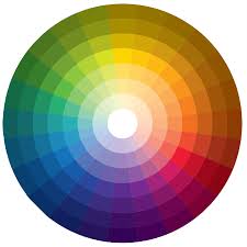
Using bright colours on soft furnishing like afghans, blankets and cushions should be done with care. This is why neutrals and beige are popular home furnishing colours. Think IKEA and 50 shades of beige. You want your home to be relaxing and not jangly all the time. Managing your style and lifestyle is about managing color

Selecting Colours for Soft Furnishings

Neutrals are best and white, cream, taupe, beige, grey and brown always look good. Although you can make a statement cushion in red to add a pop of colour to a room, the best rooms are decorated in soft neutrals like dove grey, soft blues, pale pinks and light greens. 

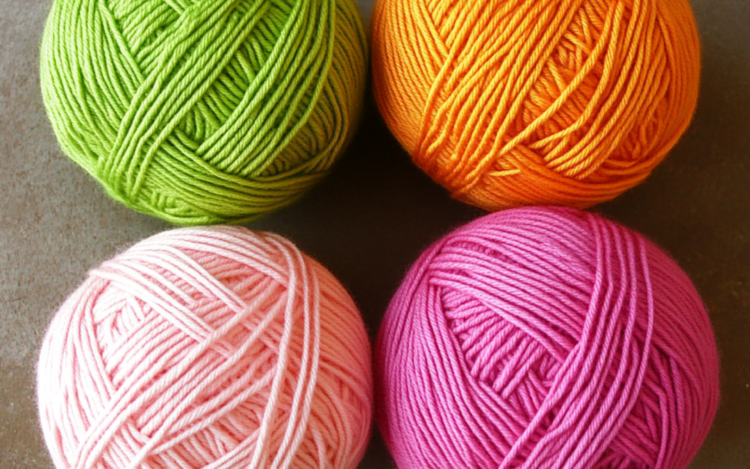
Do not use primary or secondary colours for your soft furnishings. Stay away from orange, purple and turquoise. Instead use soft heather, sea foam and light apricots. Soft hues work best and will be attractive to many people.

If you make soft furnishing to sell in your store or at craft fairs you are likely to sell more if the colour is appealing. Consider your colour choices and enjoy crafting.

Alison-headshot

Author Bio

Alison is a passionate crochet enthusiast and dedicated business blogger. She combines her love for crafting and entrepreneurship to inspire and connect with others.

With a knack for transforming yarn into beautiful creations and a flair for sharing valuable insights about running a successful crochet business, Alison embodies the perfect blend of creativity and practicality.

Read more about Alison’s crochet journey.

More Articles

If you enjoyed this post and crochet is your thing, you may like some other crochet articles from our blog.

Crocheting on the Go

Crocheting on the Go

Making Space for Crochet Special Places I have a cherished spot in my home that's dedicated to my crocheting. It's where I spend a lot of my creative time. At any given moment, you'll find me working on at least two crochet projects. One of them is usually a...

Crochet Basics

Crochet Basics

Author: Alison  -   Updated: November 2024 Crochet Basics Getting Started About Crochet Crochet is a vast subject. and you really need to know a few of the basics before you can really get into it. This post is just to go over a few of the basic points and in crochet...

The Calm Crocheter: Newsletter

The Calm Crocheter: Newsletter

"The Calm Crochet" Newsletter Welcome to the Calm Crocheter Discover the art of crochet as self-care. At Old English Creations, we believe that crochet is more than a craft—it's a soothing ritual that nurtures your mind and spirit. Our Calm Crocheter newsletter is...

Using Color in Crochet

Author: Alison  –   Updated: February 2025

Choosing Colors for Crochet Projects

Color Decisions

Align

When crocheting physical items such as hats, bags, cardigans and blankets, selecting the right yarn type is important, but equally crucial is choosing the perfect color. The colors you use in your crochet work can influence how the item is perceived, who will be drawn to it and even how well it sells if you plan to market your handmade goods.

The Importance of Color Appeal

Color selection is more than just personal preference, it affects mood, perception and desirability. While you have the creative freedom to use any color you like, certain color palettes naturally resonate with different age groups and demographics.

For example, if you were crocheting a baby blanket, a black-and-purple combination might seem out of place for most parents. While some modern parents embrace unconventional baby colors, traditionally, colors associated with infancy tend to be soft, pastel and comforting.

If you plan to sell your crochet creations, understanding color psychology and age-based color preferences can help you make informed choices that attract your target customers.

Color Preferences

Age Based

People’s relationship with color evolves over time. From infancy to old age, color preferences shift based on emotional development, personal experiences and societal influences. Below is a breakdown of how color preferences change through different life stages.

Newborns (0–12 months)

Newborns are often dressed in white, symbolizing purity and innocence. However, traditional gender-based color cues still play a role, soft pinks for girls and baby blues for boys. These gentle hues create a sense of calm and safety, which is why they are commonly used in baby clothing, blankets and nursery décor.

We used to own a baby shop and have some more ideas on color for babies.

Toddlers and Infants (1–3 years)

As babies become more active and begin exploring their environment, pastel shades remain a dominant choice. Soft yellows, mint greens, lavender and peach are popular because they maintain a sense of gentleness while adding a touch of playfulness. Pastel colors in toddler clothing and accessories signal that the child is still young, dependent on caregivers and in need of gentle handling.

Primary School Age (4–11 years)

At this stage, children are full of energy, curiosity and creativity. Their color preferences shift to bold primary and secondary colors:

  • Primary colors: Red, blue, yellow
  • Secondary colors: Green, purple, orange

Bright, saturated colors reflect the playful, adventurous nature of childhood. These hues are commonly found in toys, backpacks and kids’ clothing, emphasizing fun and liveliness.

Tweens (10–12 years)

As children enter their pre-teen years, their color choices begin to mature. Girls gravitate toward magenta, purple and deep pinks, which build upon the pastel pinks they favored as younger children. Boys start favoring blue, black and grey, signaling a shift toward a more subdued, grown-up palette. This transition is a steppingstone toward teenage color preferences, reflecting the subtle emotional and social changes tweens experience.

Teenagers (13–18 years)

Teenage color choices often lean toward more muted and moody tones. Boys and girls both adopt denim blues, dusky pinks, khaki and charcoal greys. Bright colors from childhood are toned down by adding a hint of black, creating dusky, deeper hues that reflect a shift toward maturity. Teenagers often go through phases of self-expression and their clothing colors reflect their evolving moods, independence and emerging identities. This stage marks a departure from the bright and carefree childhood palette.

Adults (19+ years)

By adulthood, color choices become more intentional and tied to lifestyle, career and personality. Adults often choose:

  • Jewel tones: Teal, maroon, emerald green, sapphire blue, these colors signal sophistication and confidence.
  • Neutral classics: Black, brown, grey, navy, white, neutral colors convey professionalism, maturity and authority.

Adults use color strategically in their wardrobes and home décor. Darker colors, especially black, suggest power and competence, while jewel tones add richness and depth to personal style.

Interestingly, color choices in adulthood also reflect status and societal expectations. A person wearing a well-tailored black coat and navy trousers is perceived differently than someone in a bright yellow outfit, simply due to the associations with those colors.

Older Adults and Seniors (60+ years)

In later life, color preferences often return to soft, pastel shades such as cream, pale blue, lavender and soft pink. These colors create a sense of calm and approachability. Lighter tones suggest warmth and gentleness, signaling a shift away from competition and status toward comfort and serenity. This return to pastels mirrors the colors worn in early childhood, marking a full-circle journey in color preference.

Understanding Color Psychology in Crochet

When crocheting for different age groups, consider how colors influence emotions and perceptions:


  • Bright colors (red, yellow, orange) = Energy, excitement and playfulness
  • Cool colors (blue, green, teal) = Calm, relaxation and trust
  • Dark colors (black, deep purple, navy) = Sophistication, authority and mystery
  • Pastels (soft pink, lavender, pale blue) = Gentleness, warmth and non-confrontation


If you are crocheting for personal use, you have complete freedom in choosing colors that make you happy. However, if you plan to sell your crochet work, selecting colors that align with your audience’s preferences can make your products more appealing and marketable.

how-to-start-a-crochet-business

Pin this to read later.

Alison-headshot

Author Bio

Alison is a passionate crochet enthusiast and dedicated business blogger. She combines her love for crafting and entrepreneurship to inspire and connect with others.

With a knack for transforming yarn into beautiful creations and a flair for sharing valuable insights about running a successful crochet business, Alison embodies the perfect blend of creativity and practicality.

Read more about Alison’s crochet journey.

More Articles

If you enjoyed this post and crochet is your thing, you may like some other crochet articles from our blog.

The Calm Crocheter: Newsletter

The Calm Crocheter: Newsletter

"The Calm Crochet" Newsletter Welcome to the Calm Crocheter Discover the art of crochet as self-care. At Old English Creations, we believe that crochet is more than a craft—it's a soothing ritual that nurtures your mind and spirit. Our Calm Crocheter newsletter is...

The Meaning of Colour

Colours Have Meaning

You can use colour to boost your mood.

Wear the colour you like or choose a colour whose meaning is how you want your day to go.

imagesPastel, primary, jewel or darks?

Pastels (lemon, lavender, mint green, baby pink and baby blue) are calming, soothing and non-confrontational. Pastels look good on babies and the elderly.

Primaries (red, yellow and blue) all stimulate the brain but in different ways.

Jewel colours (purple, teal, amber and ruby) are grown up and indicate confidence, up beat and positive vibes.

Dark colours suggest control and power. They can imply seriousness and subdued danger.

Red

Red is the colour of challenge, courage and sex. It says “Look at me” and that danger is near.

Red is stimulating and that is why it is the colour favoured in restaurants and good for your dining room because it stimulates conversation.

Orange

Orange is rude. It is a colour that suggests caution and be careful. If you wear orange you are sending the message that you are unpredictable and others should watch out. But that you are fun loving and unique.

Yellow

Yellow is the colour of sunshine and creativity it is a difficult colour to wear near your face as it reflects a yellow glow that is not always flattering.

Yellow’s message is one of inspiration and lateral thinking. Wearing yellow aids creative solutions to problems. It is a good color to wear when you want some fresh ideas to pop into your head.

Green

Green is the colour for peace and tranquility. It should be worn to calm and rejuvenate your psyche.

Mint green is calming but chartreuse suggests some spiky ideas running through your head.

Blue

Blue in its purest sense is what used to be called French blue and it is like a sapphire blue.

This is a strong color and the wearer is confident and fair. The darker the blue the stronger the person.

Pale blue is for young children or men’s formal shirts which are covered by grey or charcoal suits.

Indigo

Indigo is a colour for getting things done it works well for men and women. It is confident and casual at the same time. Think dark denim jeans which are both smart and casual.

Violet

Violet is the colour of originality. If you wear violet you are stating that you are your own man or woman and will do your own thing in life. Violet in home furnishing can be wild flowers and heathery creamy violets work well.

White

White looks good on just about anyone. A sharp white blouse is a wardrobe staple. White next to your face in blouses or shirts is flattering to all complexions.

Black

Black is a serious city color. Most people can wear black and be taken seriously. Black pants are a woman’s wardrobe staple.

Brown

Brown is a color to wear when you are feeling down and want to hide from life. It is a colour for doing nothing in. It indicates you may be forlorn or pining for days gone by. It can be a sign of depression and if you wear brown it will make you feel browned off and life weary.

Grey

Grey is a colour that wants to blend into the background. It is a non confrontational colour and suggests the wearer is passive and will conform to the will of others. It is a colour that wants peace and quiet.


You may also like:

  • Colour magic
  • Selecting colour for soft home furnishings

More Color Articles

Here are a few more articles about color and how to best use it in your life.

Alison-headshot

Author Bio

Alison is a passionate crochet enthusiast and dedicated business blogger. She combines her love for crafting and entrepreneurship to inspire and connect with others.

With a knack for transforming yarn into beautiful creations and a flair for sharing valuable insights about running a successful crochet business, Alison embodies the perfect blend of creativity and practicality.

Read more about Alison’s crochet journey.

More Articles

If you enjoyed this post and crochet is your thing, you may like some other crochet articles from our blog.

The Doll’s House Maker

The Doll’s House Maker

Joe's Story Background Joe was married and had three kids at school. Joe's skill was woodworking. His talent was crafting wooden doll‘s houses. With having two daughters he had made the first doll's house when the girls were very young and they had hours of fun...

The Calm Crocheter: Newsletter

The Calm Crocheter: Newsletter

"The Calm Crochet" Newsletter Welcome to the Calm Crocheter Discover the art of crochet as self-care. At Old English Creations, we believe that crochet is more than a craft—it's a soothing ritual that nurtures your mind and spirit. Our Calm Crocheter newsletter is...